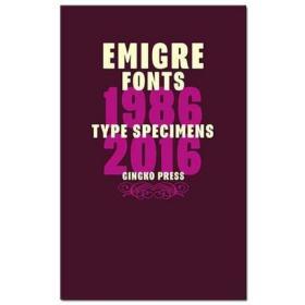

Emigre Fonts: Type Specimens字体标本1986-2016 字体设计原版书籍
移民小册子的目的是为了让人们喜欢它们的字体和深奥的内容
¥ 268 九五品
仅1件
北京通州
认证卖家担保交易快速发货售后保障
作者Gingko Press
出版社Gingko
ISBN9781584236207
出版时间2016-06
版次1
装帧精装
开本24开
上书时间2024-05-26

- 最新上架


商品详情
- 品相描述:九五品
- 商品描述
-
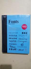
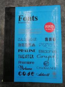
In 1985, Berkeley-based graphic design company Emigre, the publisher of the legendary design magazine of the same name, launched one of the first independent digital type foundries to explore the new design possibilities offered by the MacIntosh computer. To announce each of their new typeface releases, Emigre published small booklets displaying the virtues of the fonts and revealing the processes used to design them. By creating specific contexts, many of these so called "type specimens" went beyond being simple sales tools. In fact the Emigre booklets were meant to be enjoyed as much for the typefaces as for their esoteric content.
1985年,总部位于伯克利的平面设计公司 emigre,同名传奇设计杂志的出版商,成立了第一个独立的数字字体铸造厂之一,以探索 macintosh 电脑提供的新设计可能性。为了宣布他们发布的每一款新字体,移民出版社出版了一些小册子,展示了字体的优点,并揭示了设计它们的过程。通过创造特定的环境,这些所谓的“模式标本”中的许多,超越了简单的销售工具。事实上,移民小册子的目的是为了让人们喜欢它们的字体和深奥的内容。

相关推荐


— 没有更多了 —
以下为对购买帮助不大的评价