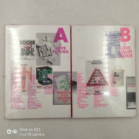


I Love Type series A+B 我爱字体系列平面字体设计书籍 2本合售 塑封
¥ 179 九五品
仅1件
河北衡水
认证卖家担保交易快速发货售后保障
作者Gingko Press
出版社Gingko Press
年代不详
装帧平装
页数320页
货号Z16
上书时间2023-12-25

- 在售商品 暂无
- 平均发货时间 9小时
- 好评率 暂无
- 店主推荐
- 最新上架


商品详情
- 品相描述:九五品
- 16 x 3.5 x 23 cm
- 商品描述
-
One of the most used sans serif typefaces, Futura is synonymous with efficiency and modernity, with its clean, even strokes, geometric shapes and lack of decorative flourishes. Created in 1927 by Paul Renner, it shows the influence of German Bauhaus, and has inspired an army of geometric typefaces in the years since its inception. Futura's iconic status and simplicity have inspired the designers in this text to push for innovation.
Futura是最常用的无衬线字体之一,其简洁、均匀的笔触、几何形状和缺乏装饰性的华丽装饰,是效率和现代性的代名词。它由保罗·雷纳于1927年创作,展示了德国包豪斯的影响,自成立以来的几年里激发了一支几何字体大军。Futura的标志性地位和简洁性激励了本文中的设计师推动创新。

— 没有更多了 —
以下为对购买帮助不大的评价